


How to Wear All Neutrals Without Looking Flat
The secret to wearing all neutrals without looking washed out isn't about adding color. It's about understanding fabric, tone, and where the light hits.
I've had this conversation more times than I can count, usually over coffee, usually with someone who's just cleaned out her closet and realized that 80% of what she owns is beige, cream, taupe, or sand. She loves neutrals. She gravitates toward them instinctively. But somewhere between the mirror and the front door, the whole thing falls flat. Everything blends together. She looks tired. The outfit disappears.
The standard advice is to add a pop of color. A red lip, a bright bag, a shoe in cobalt blue. And sure, that works. But it also sidesteps the question. If you love neutrals, if they feel like you, then figuring out how to wear all neutrals without looking washed out is worth the effort. You shouldn't have to compromise the palette just to feel finished.
Living in Dubai has taught me something about this. The light here is relentless. It flattens matte fabrics and makes certain tones disappear against skin. But the women who dress well in this city, the ones you notice at a Friday lunch at Scalini or walking through DIFC on a Tuesday, they wear neutrals constantly. They just do it differently.
Why Some Neutral Outfits Fall Flat (and Others Don't)
The problem is almost never the color itself. It's the sameness. When every piece in your outfit has the same weight, the same texture, the same finish, the eye has nowhere to land. There's no contrast, no movement, nothing to hold attention. You could be wearing the most beautiful shade of champagne, but if the top, bottom, and outer layer are all the same matte jersey in the same tone, it reads as one undifferentiated block.
That's the real issue. Not neutrals. Monotony.
The fix isn't complicated, but it does require some intention. You need variation in at least two of these four things: texture, tone, weight, or shine. You don't need all four working at once. Two is enough. Sometimes one is enough, if it's the right one.
Start with Texture, Not Tone
This is the single biggest shift you can make. Before you think about which shade of beige or ivory you're reaching for, think about what the fabric is doing.
A viscose knit has a soft drape that catches light differently than a structured cotton. Satin reflects. Linen absorbs. A ribbed knit has dimension that a flat weave doesn't. When you pair two neutrals that are close in tone but different in texture, the outfit suddenly has depth. It looks considered, not accidental.
I wore a tencel knit set recently, the Sevin Dress Set, to a gallery opening in Al Quoz. Both pieces were the same family of neutral. But the draped top had a different weight than the skirt, a slightly different way of moving. Under the gallery lights, it looked like two shades, even though it wasn't. That's texture doing its job.
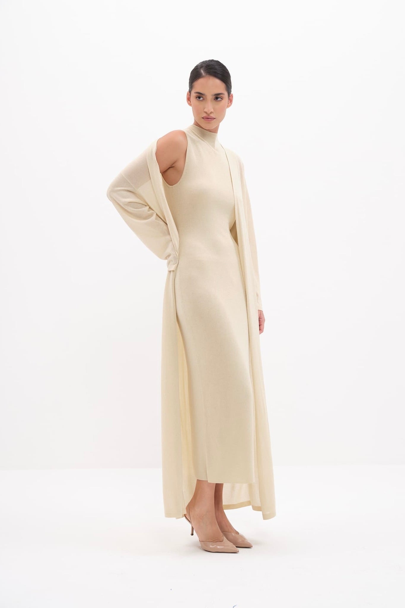
The easiest texture combinations to remember: pair something fluid with something structured. Or something matte with something that has a slight sheen. You're creating a conversation between the pieces instead of dressing in a uniform.
The Tone Trick That Actually Matters
Here's what most advice gets wrong. People talk about warm neutrals and cool neutrals like they're two separate wardrobes. Choose your undertone and stay in your lane. But in practice, wearing all warm or all cool neutrals head to toe can look just as flat as mixing them carelessly.
What works better is a tonal range. Think of it like a gradient. Your lightest neutral near the face, your deepest one furthest from it. Or the reverse, if that suits you more. The point is movement from light to dark, or dark to light, so the eye travels.
A cream top with sand-toned trousers and tan shoes. An ivory blouse under a camel coat. A pale champagne dress with a deeper taupe bag. These aren't different colors. They're different depths of the same idea. And that range is what keeps the look from going one-note.
In Dubai, this matters more than elsewhere because the light is so bright and so even. There are no gray skies to add moodiness to your outfit for you. You have to build the contrast yourself.
How to Find the Neutrals That Work for You
Forget color theory for a moment. The fastest way to find your flattering neutrals is this: hold the fabric near your face in natural light. Not store light, not bathroom light. Natural light. If your skin looks clearer and your eyes look brighter, that's your neutral. If everything flattens out and you suddenly look like you need more sleep, it's the wrong one.
This takes about three seconds per shade and it's more reliable than any chart. The women I know who wear neutrals beautifully have done this, consciously or not. They've figured out their cream (warm or cool), their mid-tone (sand, mushroom, greige, khaki), and their deep (chocolate, espresso, charcoal). Three anchors. That's plenty.
One thing I've noticed: the neutral that works against your skin near the face doesn't have to be the same neutral you wear everywhere else. A cooler taupe might wash you out as a top but look perfectly fine as a trouser or skirt. So if you've written off an entire shade, try it further from your face before you give up on it entirely.
Where Fabric Weight Changes Everything
Weight is underrated. A lightweight bamboo jersey sits on the body differently than a heavier viscose knit. Even when the color is nearly identical, the way a lighter fabric moves creates shadows and dimension that a heavier fabric holds still. Layering a lighter piece over a heavier one (or the reverse) adds the kind of visual interest that keeps a neutral outfit from feeling like pajamas.
Something like the Melissa Draped Gown in bamboo jersey is a good example. It's a single neutral, but the draping creates its own tonal variation. Where the fabric gathers, it deepens. Where it falls straight, it lightens. The dress does the work of multiple tones without you having to think about it. (The kind of piece that makes getting dressed feel simple, because it is.)

This is especially useful in Dubai's climate, where you want breathability without sacrificing polish. Heavier fabrics hold their structure but can feel like too much by midday. Lighter ones move, but they need the right cut to avoid looking undone. The sweet spot is a fabric with enough body to hold a shape but enough softness to drape. Viscose knit, bamboo jersey, TENCEL lyocell. These are the fabrics that let you wear neutrals in this city without everything wilting by lunch.
The Case for One Piece with Shine
I'm not talking about sequins. I'm talking about a subtle sheen. Satin, a polished knit, a fabric with a hint of lurex. One piece with a reflective quality in an otherwise matte neutral outfit acts like a light source. It lifts the whole look.
This is why a satin trouser with a matte knit top in similar tones looks so much more alive than the same outfit in all matte. The satin catches the light and creates a focal point. Your eye moves to it, and suddenly the outfit has direction.
Naia satin is particularly good at this. It has a softer sheen than traditional satin, more of a glow than a glare. Paired with something in viscose or tencel knit, it adds just enough contrast to make the neutrals read as intentional rather than unfinished. Browse the sets collection and you'll see how pairing satin with knit in similar palettes creates that layered, tonal quality that makes neutral outfits work.
Why You Probably Love Neutrals (and Why That's Fine)
There's a reason some women reach for neutrals instinctively. It's not laziness. It's restraint. Neutrals let the cut, the fabric, and the fit do the talking. They age well. They photograph well. They don't compete with jewelry or makeup or the sunset at a rooftop dinner. They're the background that lets everything else come forward.
If you've ever stood in front of your closet full of color and felt overwhelmed, but then put on a cream dress and felt like yourself, you already understand this. You don't need convincing. You just need the right tools to make it look as good on the outside as it feels on the inside.
And the women in Dubai who've figured this out, the ones who look effortless at a weekend brunch at LPM in head-to-toe sand and ivory, they're not following a formula. They've just learned to pay attention to the details that create dimension. A different neckline. A fabric that moves. A shade that's two degrees darker or lighter than the one next to it.
A Simple structure (That Isn't a Rule)
I don't love rigid style rules. The 3-3-3 rule, the 5-5-5 rule, capsule formulas. They make good headlines but they don't account for how you actually live. Some weeks you have four events. Some weeks you have one. Some mornings you have ten minutes and some mornings you have forty-five.
But if you want a loose structure for wearing all neutrals well, here it is: two textures and a tonal shift. That's it. Make sure at least two of your pieces have different textures (matte and sheen, knit and woven, structured and draped). And make sure there's some variation in depth, even just a half-step lighter or darker between your top and bottom.
If you do those two things, you can wear cream from collar to hem and look anything but washed out.
Accessories in Neutral: Keep Going or Break It Up
You don't have to add a contrasting bag or shoe. You can, and it's a perfectly fine choice. But if the goal is a fully neutral outfit, your accessories should follow the same logic as the clothes: variation in tone and texture.
A gold shoe with a beige dress. A tortoiseshell sunglasses frame against an ivory top. A bag in a slightly warmer or cooler neutral than the rest of the outfit. These small shifts are enough. They give the eye something to catch without breaking the palette.
What I'd avoid: matching everything exactly. The same beige bag, same beige shoe, same beige belt. That precision reads as costume. A little imperfection, a little warmth against cool or depth against light, reads as taste.
The Dubai Factor
We covered what to wear in this city in more detail in our guide to what to wear in Dubai, but when it comes to neutrals specifically, there are a few things worth noting.
The sunlight here is warm and direct, which means warm neutrals (cream, camel, sand, honey) tend to glow, while cool neutrals (grey, mushroom, slate) can look a little dull outdoors. Indoors, under air conditioning and cooler lighting, the reverse is sometimes true. So if you're dressing for a day that moves from outdoor to indoor (which in Dubai is every day), mixing a warm neutral with a cool one can actually balance things out across both settings.
Also, white counts as a neutral, and it's everywhere here for a reason. A clean white acts as a reset between softer neutrals. A white top grounds a sand skirt. A white accessory sharpens an all-beige outfit. Don't be afraid of it.
The dresses collection has a good range of pieces in neutral tones that hold up in this light, in fabrics that were specifically chosen for how they move and breathe in this climate. If you're building a neutral wardrobe here, that's a place worth spending some time.
The truth about wearing all neutrals is that it's easier than most people make it. You don't need a color wheel or a personal stylist or a seasonal palette analysis. You need good fabric, a little tonal range, and the confidence to let the simplicity speak. The women who do this well aren't thinking about rules. They're thinking about feel. And when it feels right, it looks right too.